

Does God Care About Color?
Finding God in a graying world


You’ve likely heard the argument that the world is getting grayer. You’ve seen the graphs and side-by side photos showing that cars, clothes, buildings, the colors of everyday living are trending towards muted blacks and beige. While these tones have their place, their overrepresentation brings bleakness to a world which, from the start, God populated with a vast array of hues and tones.
Color is a language used by dress and décor, but also by the Divine. The decrease in color is a decrease in expression, and a loss of the true wonder with which God filled the world. To understand what this increasing sameness is doing to you, and why it matters, we have to look beyond modern fashions and see what color is for.
Today, we explore what thinkers like Aquinas, Aristotle, and Aldous Huxley wrote about color, and examine why the world is becoming less vibrant. We also look at both the biological and theological significance of color, and what you can do to resist the impending graypocalypse…
Our mission here at Letters from the Old World is to share the secrets of Old World elegance, and our approach is two-fold:
1) Every Wednesday, we send a free article exploring the theology and philosophy of why beauty matters, particularly in regards to decor and dress.
2) Every Friday, we send What’s In a Fit, a members-only article exploring practical tips and guidelines for dressing well.
If this resonates with you, then subscribe below to join the aesthetic renaissance.
God’s World Is Not Gray
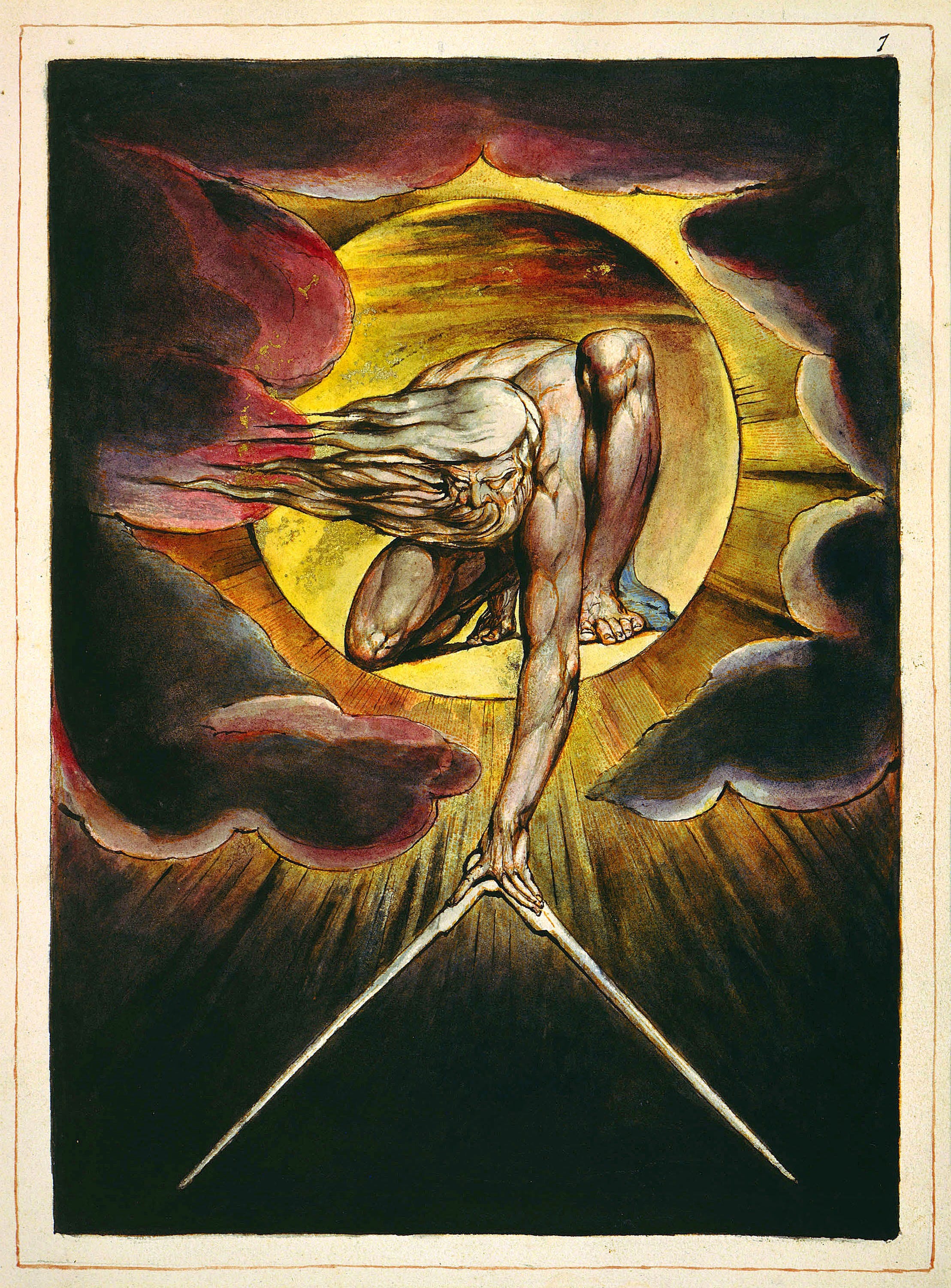
Like the appearance of a rainbow in the clouds on a rainy day, so was the radiance around him. This was the appearance of the likeness of the glory of the Lord.
-Ezekiel 1:28
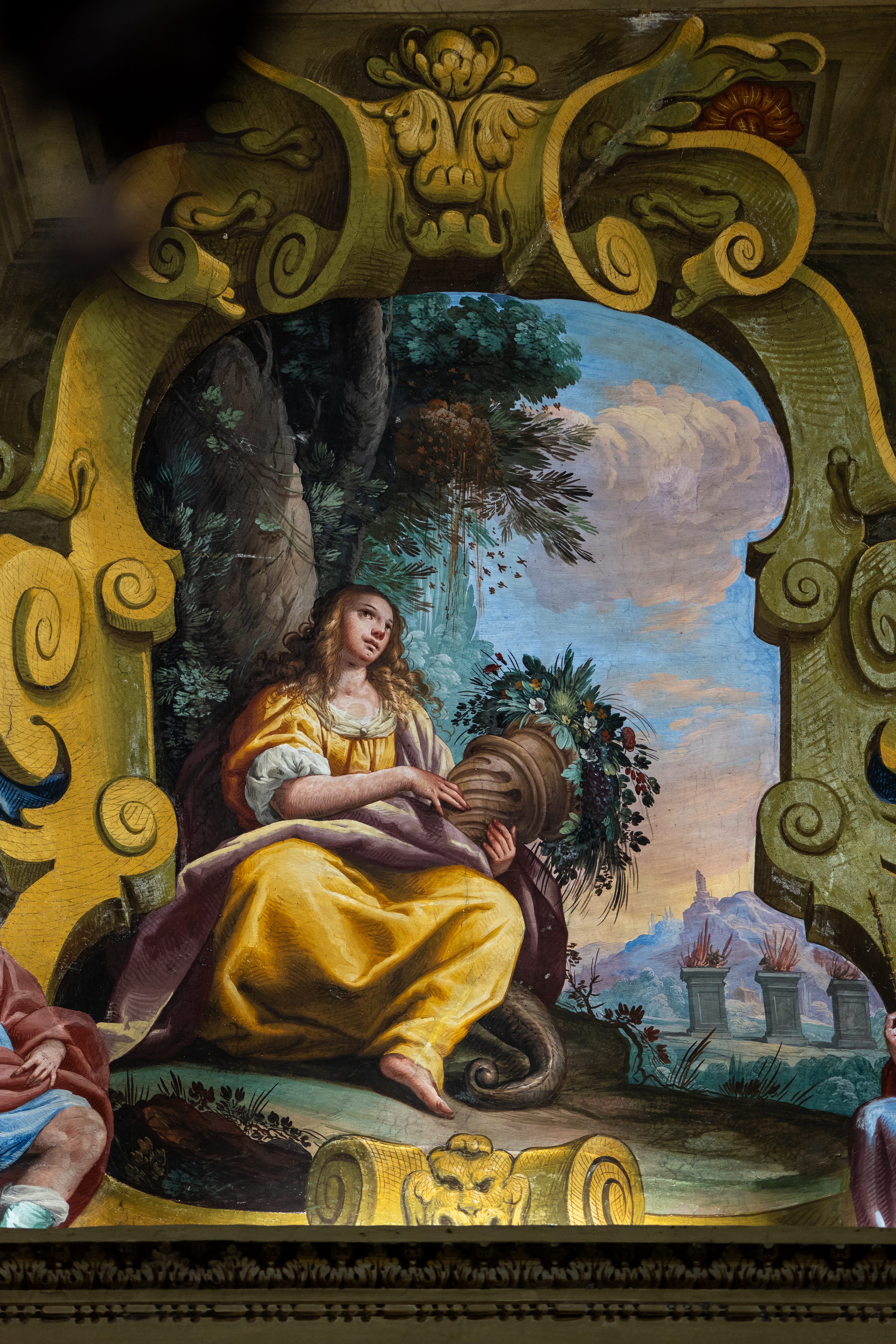
Color is everywhere in the Bible, and usually deeply symbolic. Scarlet sins washed white, priestly garments of gold, blue and purple, pavement as bright blue as the sky, there’s a whole painter’s palette’s to choose from. The rainbow, one of the most multicolored phenomenon in nature, is a sign from God of his covenant with the earth after the flood. (Genesis 9:13)
Much of this imagery implies significance that is still with us today. For instance, Nathanial Hawthorne’s The Scarlet Letter was scarlet because the color had implications of sin, lust, and temptation; ideas that can be traced back to scripture.
Creation itself, filled with every shade imaginable, attests to God’s love of color, which should tell us something. In Romans 1:20, Paul writes that God’s eternal power and divine nature are understood from what has been made. This is a point St. Augustine reiterates in his examination of Matthew 11:25, where Christ says that God has hidden things from the wise that he has revealed to little children.
How does God do this? Augustine says it’s through the book of nature:
Others, in order to find God, will read a book. Well, as a matter of fact there is a certain great big book, the book of created nature. Look carefully at it top and bottom, observe it, read it. God did not make letters of ink for you to recognize him in; he set before your eyes all these things he has made. Why look for a louder voice? Heaven and earth cries out to you, ‘God made me’.
But more than just nature, we can find God’s love of color within the concept of beauty itself…
Beauty, Claritas, and Aquinas
Color has always been an essential component of the visual language of both the world and of God. In Thomas Aquinas’ Summa Theologiae, he even links color to language through the person of Christ.
Aquinas’ reasoning goes that, since we only know God through created things, we must approach him in the same way we approach creatures. One of these ways is through beauty, which Aquinas and theological tradition both associate with the person of God the son.
Aquinas then presents his three conditions for beauty:
“integrity” or “perfection” (integritas), since those things which are impaired are by the very fact ugly; due “proportion” or “harmony” (consonsantia); and lastly, “brightness” or “clarity” (claritas), whence things are called beautiful which have a bright color.
He then links each of these criteria to a property of the son. The element of claritas, in particular, mirrors the son’s status as the word and light of God. Just as claritas allows a thing to be clearly known for what it is, the Logos is that which makes God knowable to us. In this way, color and brightness share a kinship with language, as both intelligibly reveal form, meaning, and truth.
It’s clear then that God does not forbid or condemn color for its own sake, but rather delights in it. But of course, that’s not the only reason you should care.
Colors Affect You On a Deep Level
Color isn’t just a question of looks, it can also have profound impacts on you. A recent systematic review of 128 years of psychological research found that humans systematically and reliably associated certain emotions with certain colors. Take a look at the associations they found for grey, black, and brown, colors increasingly dominating your environment:

Is it any wonder life feels miserable when the majority of the hues around you communicate emotions like fear, regret and evil?
It’s not meant to be this way.
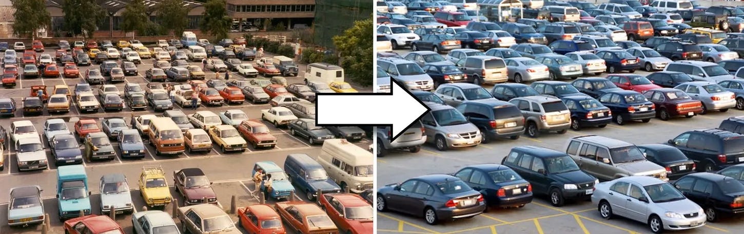
We Had Color, Once
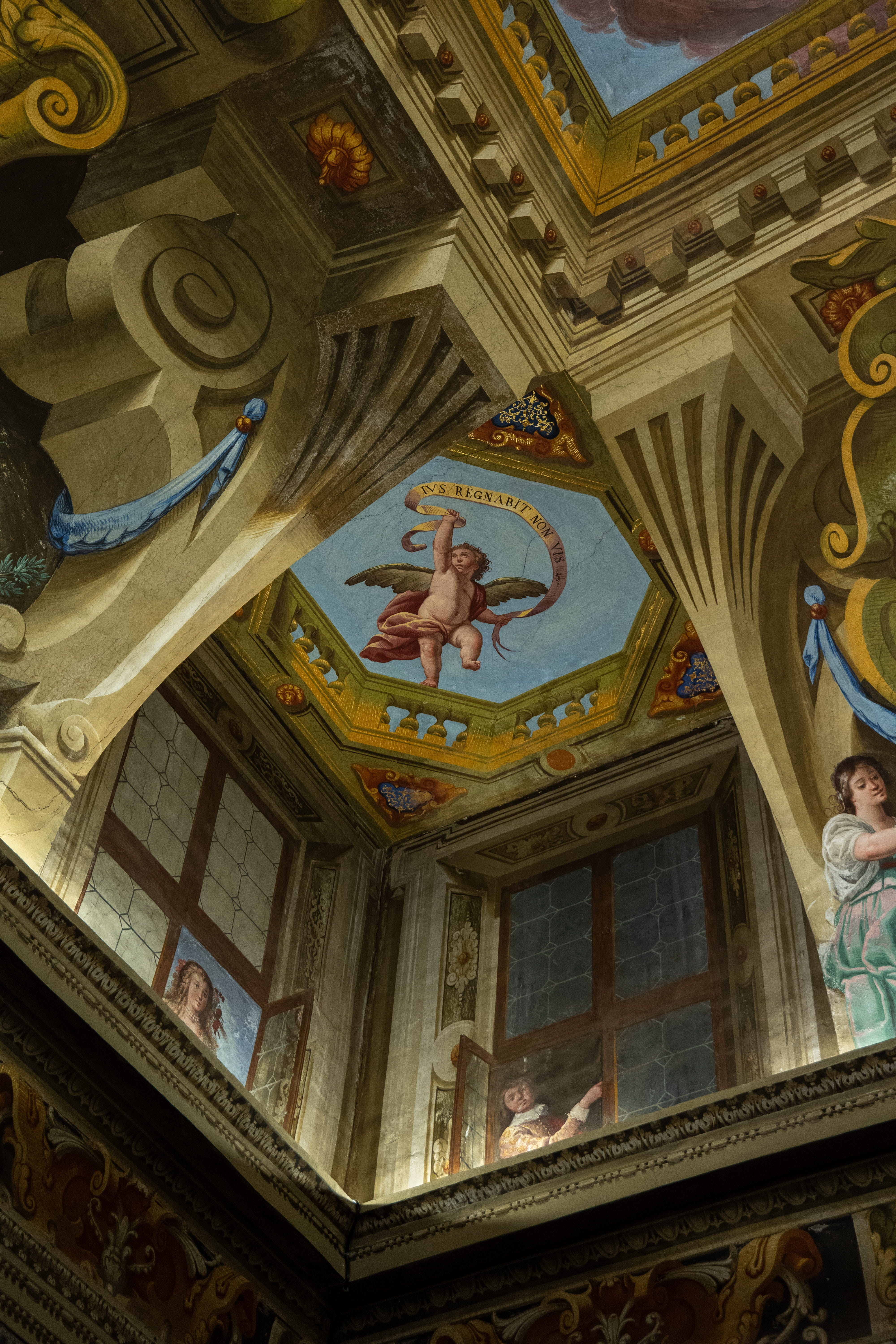
There is a type of chronological snobbery of color today. Many people think of the past as brown-grey and dark in movies due to the medieval filter placed on them and early film and photographs presenting a sepia or black and white world. But this was not the case. In fact, Italian medievalist, philosopher, and novelist Umberto Eco says that the Middle Ages were a time of bright hues:
It was a period that identified beauty with light and color (as well as with proportion), and this color was always elementary, a symphony of reds, blues, gold, silver, white, and green, without subtleties and half tones. […] In medieval poetry this sense of radiant color is always present: the grass is green, blood is red, milk pure white, and a pretty woman, in the words of Guido Guinizzelli, has ‘a face of snow colored in carmine.’
-Umberto Eco, The Beauty of the Flame
Even as late as the 19th century, color was everywhere. New chemical processes allowed the Victorian textile industry to experiment with dozens of new synthesized tints, leading one 1861 article titled The Triumph of Colour to comment “…never were the ladies of England dressed in such brilliant hues as the present day.”
So what went wrong?
Manufacturing Monochrome
If you recognize the graph below, you’ve heard this before, so feel free to skip ahead a bit. But if you don’t, it’s from a well-known study by the UK’s Science Museum Group, which examined 7000 everyday or familiar objects across 200 years. Their research produced a graphic detailing the progressive desaturation of objects since the 1800s:

Where white, black, and gray were about 15 per cent of all colors in the 1800s, they made up nearly 50 per cent by 2020. The study found that the most notable trends were an increase in gray over time and a decline in brown and yellow, which they theorized “likely reflect changes in materials, such as the move away from wood and towards plastic.”
This changes in materials correlates somewhat with industrialization of production, and may explain some of this desaturation. After all, pigmentation wasn’t free, especially at scale, which means manufacturers of the everyday may have foregone colors.
There’s no better representation of this than the father of the production line Henry Ford, who once (might have) quipped: “Any customer can have a car painted any color that he wants so long as it is black.”
Color as Low-Status?
But Ford wasn’t the only one with an attitude when it came to color. There’s a long history of thinkers being suspicious of color as either unnecessary or low-brow. Aristotle called color a drug; Goethe wrote that “people of refinement avoid vivid colors.” Aldous Huxley, writing in 1956, bemoaned mass production’s giving us “too much of the best things” and thus cheapening the experience of color: “Familiarity breeds indifference. We have seen too much pure, bright colour at Woolworth’s to find it intrinsically transporting.”
In short, color was often dismissed as for the plebs.
This attitude was not uncommon at the time of Huxley’s writing, which may explain the slow fade of color in things like interior décor since then. Like most trends, when color was hard to get it became associated with high status, making lower-class or low-status people desire to emulate it, which then leads to upper-class flight from color.

But whatever the reason for this newfound beigeness, there’s no reason you have to take part in it.
Reclaiming Color
If you want to see a more colorful world and fight against the impending graypocalypse, it can feel overwhelming on an individual level. Just start with what you can handle. Even something as small as nurturing an office plant or flower is a great way to combine a sense of stewardship with a sense of beauty.
At home, you can be more intentional with the art you hang up and the hues you bring into your house; not everything you buy has to be navy blue or black. Consider, for instance, the bright pigments for which kitchenware brand Le Creuset is known, which make your kitchen or dinner table a bright spot amidst normally neutral tones.
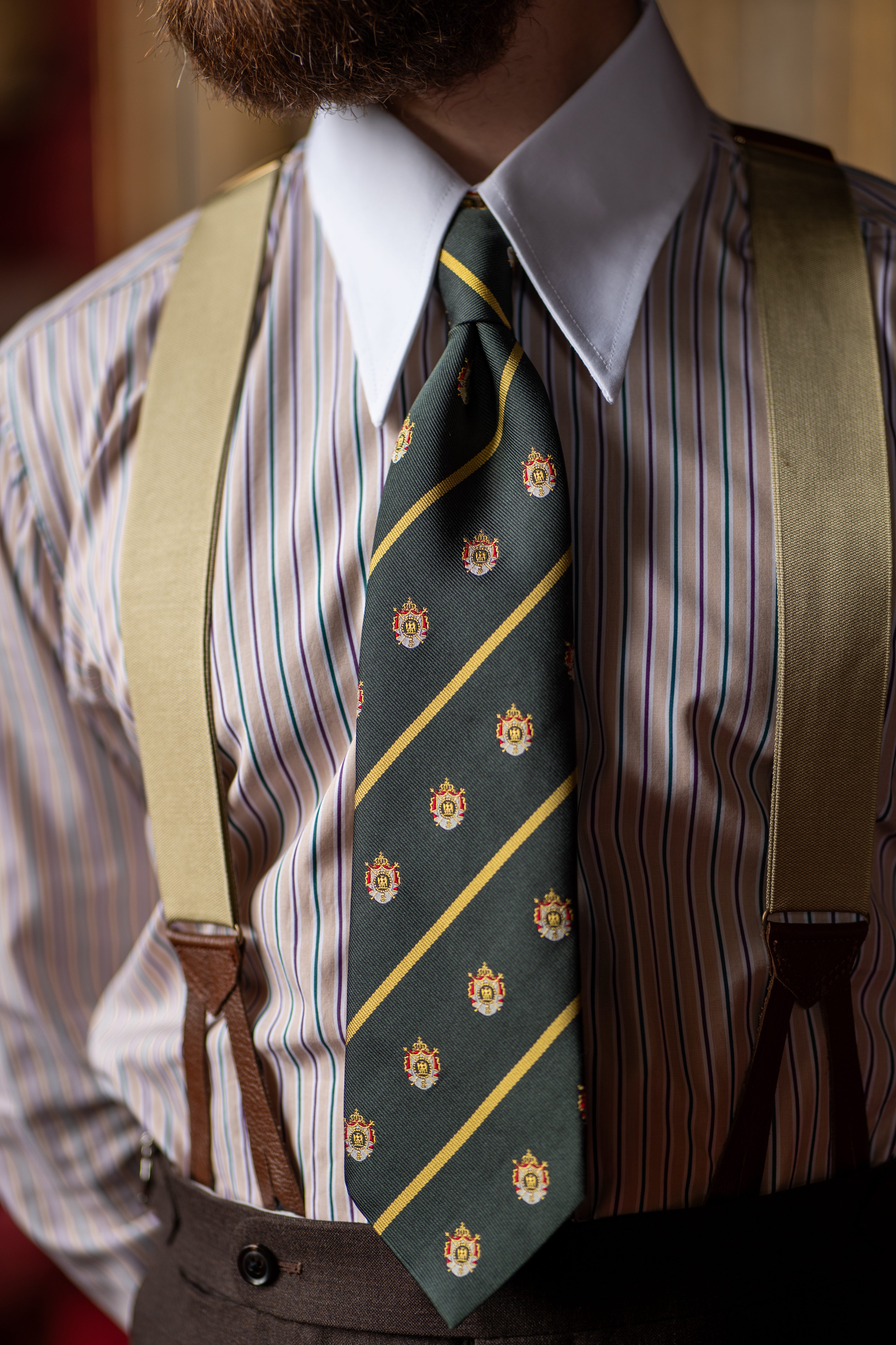
Another easy way you can start is daring to add a bit of color to your wardrobe. This can be as simple as a shirt, tie, pocket square or piece of jewelry, small accent pieces that don’t overwhelm, but complement. See how you handle some more adventurous colors, and you might find people appreciate you brining some brightness to their day. This one can be daunting, we know, so if you’d like to learn more about how to go about this, check out our What’s in a Fit Friday articles for paid subscribers, or drop in to the subscriber chat and ask us your questions.
No matter how you go about it, by taking that first step, you will start to encounter the full breadth of vocabulary the language of color has to offer.
The Bright and the Beautiful
Once you finally let go of the tones that everyone defaults to and begin to engage meaningfully with color, you enter in to a visual conversation that stretches back to biblical times. You don’t even need an overt awareness of what every color means, just an interest in learning more about how to use it.
Choosing color over blandness is not a banal act. Color speaks. It communicates that you are excited to engage with the God-given world in all its fulness and glory. It rejects a stale conformity that, on a long enough timeline, would see everything turned into a black and gray goo.
When you bring color out into the world, you share a message that it’s important to try. It’s important to take risks for the sake of making the world a more captivating, more human, and more beautiful place.
Of course, God cares about color. If he didn't, why create them? Why build churches with colorful stained glass or make flowers with hundreds of different colors? Colors are important and here for a reason. Without them, this world would be ugly and would lose all its divinity. And that's the agenda in modern times.
Great article on colors and their importance.
There’s an interesting discussion in Krista West’s book “The Garments of Salvation” about how Newton’s discovery of the color spectrum changed the way we interact with color. She says that, essentially, we went from a much more straightforward spectrum of bright vs. dark and matte vs. shiny to the modern color wheel with its overbearing emphasis on matching and balance.
I think my larger point is that, to embrace color and vibrancy properly, there needs to be a cultural framework that tolerates at least a certain amount of chaos.