

New to Style? Start here.
Color, contrast, and more...

There’s a major problem with fashion influencers.
Since becoming active on Instagram several months ago, I’ve started to pick up on the major trends that dominate men’s style advice. While there is no shortage of obvious flaws (flagrant consumerism, an undue focus on brand names, etc.) the real mistake is far more subtle. And because it’s subtle, it threatens to derail the efforts of normal, well-intentioned people who just want to learn how to dress well.
The error is this: none of the advice that’s given has to do with how something looks on you. And how could it? How in the world could one influencer give personalized advice to an audience of millions?
Contrary to popular belief, dressing well isn’t just about learning which colors and fabrics go well together. It’s about learning what actually looks good on you: it’s intensely human and personal, because no two people are alike. “Just buy a suit” is awful advice. Instead, you ought to focus on things like picking colors based on your skin tone, and mirroring the degree of contrast in your face with the degree of contrast in your clothing. In short, your dress should be an extension of your natural features.
To be clear, none of this is done for the sake of vanity, but because you have a sacred duty to dress your best. With that caveat in mind, let us now proceed with practical advice on how to do so.
Every Friday here at Letters from the Old World, we publish an edition of What’s In a Fit: members-only articles where I break down a specific look in order to demonstrate principles of classic menswear. Because the best style advice is based on the specifics of you as an individual, and since it is impossible to do this all at once for thousands of readers, I believe this is the best approach to take. By providing specific examples of what works and what doesn’t on specific individuals, you can learn how to extrapolate these principles to yourself, and thus develop your own personal style.
In this first edition of What’s In a Fit (made free for all readers), I’m going to break down one of my favorite combinations of shirt, suit, and tie. We’ll look at why it works for me, why (or why not) it might work for you, and what it reveals about two core principles of classic style...
Mirroring What’s Above with What’s Below
If your eyes are windows to your soul, then your face is the façade (yes, there’s a reason for that etymology) on which those windows appear. All of your ideas, expressions, and emotions are painted onto the canvas of your face: your clothing, therefore, ought to provide an elegant frame for that art. Matching the degree of contrast in what you wear with the degree of contrast in your facial features is the best way to achieve such a frame.
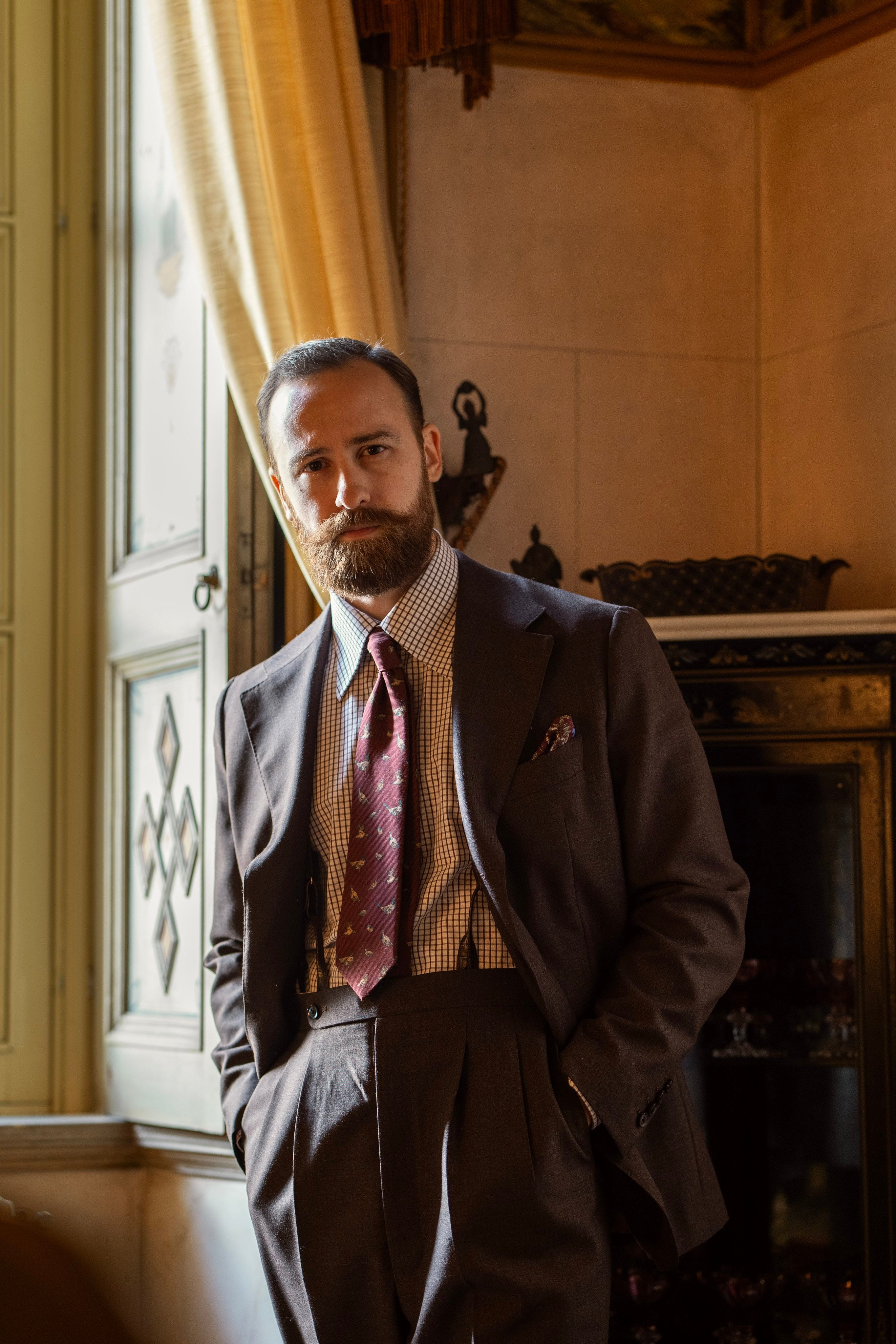
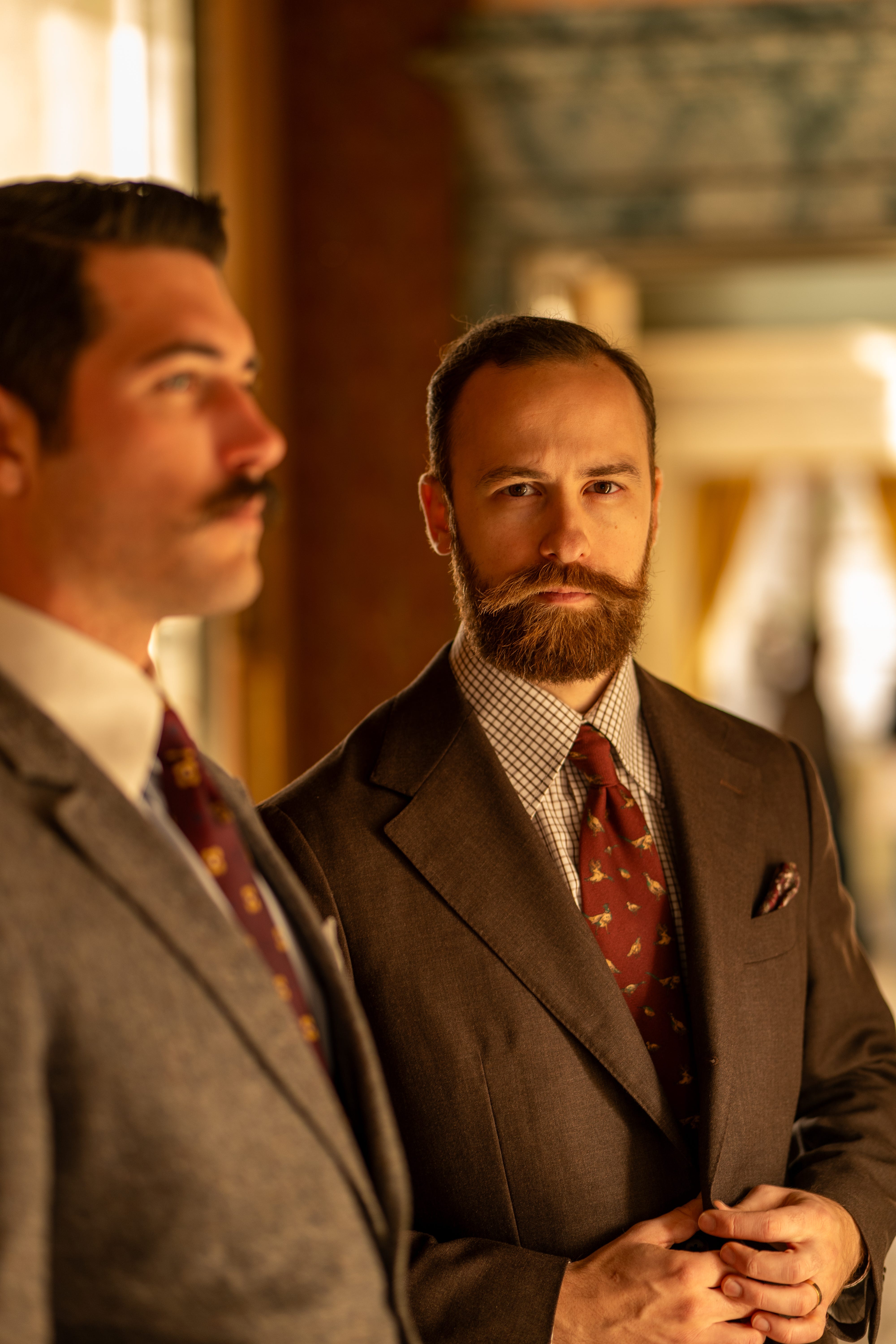
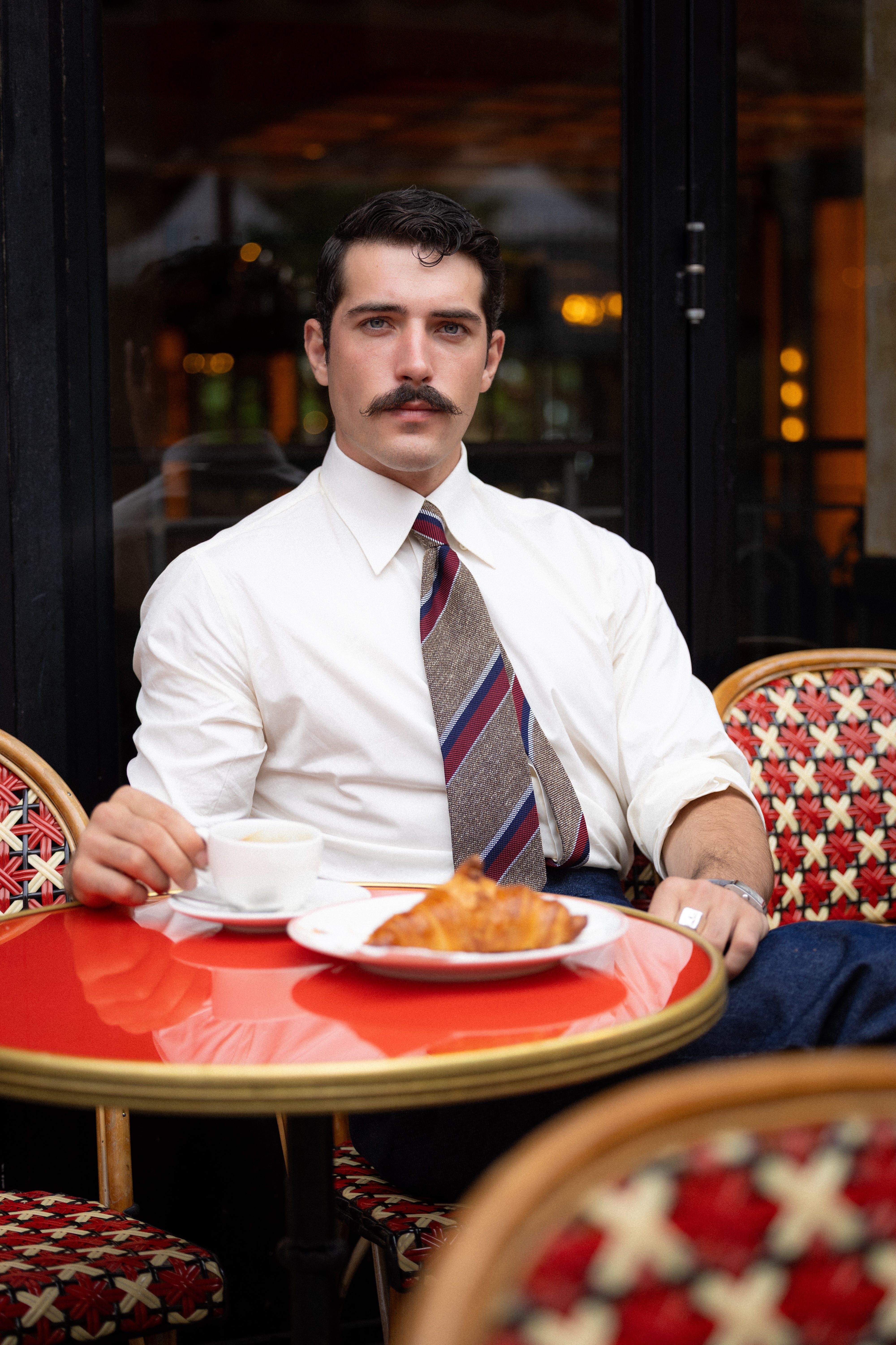
Everyone falls on the spectrum of low to high-contrast features. I, for reference, have mid to low-contrast features, meaning there’s not a stark difference between the color of my skin and that of my hair, eyes, and eyebrows. My friend Vincent, on the other hand, has high-contrast features:

For someone with mid-contrast features like me, a cream shirt and dark grey suit provide a much more elegant frame than a white shirt and black suit: something which would look better on Vincent. Where it gets interesting, though, is that the degree of contrast in your facial features actually changes according to the season. The more sun you get, the more your facial contrast heightens, which is part of the reason why tropical climates encourage more vibrant color combinations.
That, however, is a topic for another day.
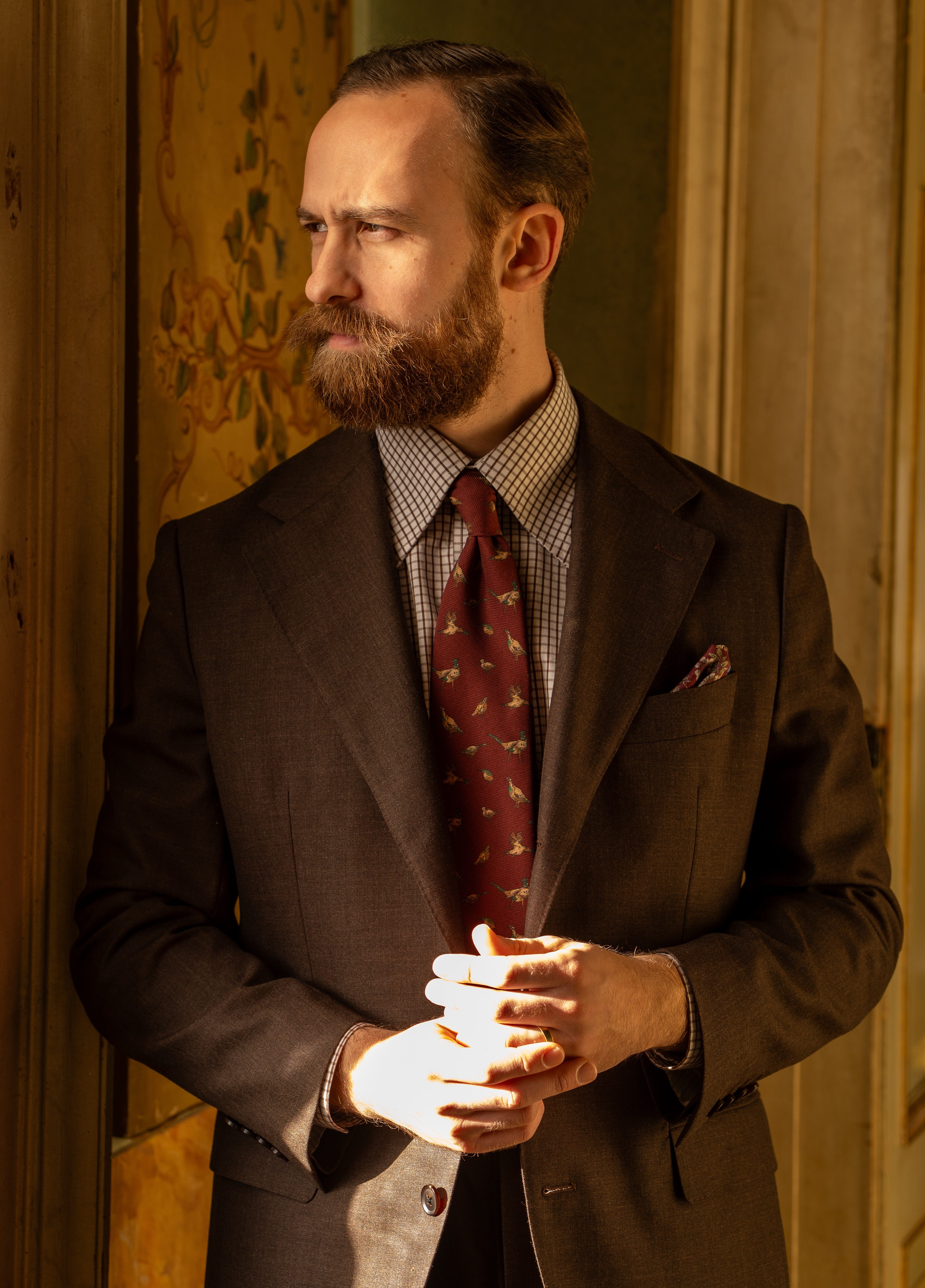
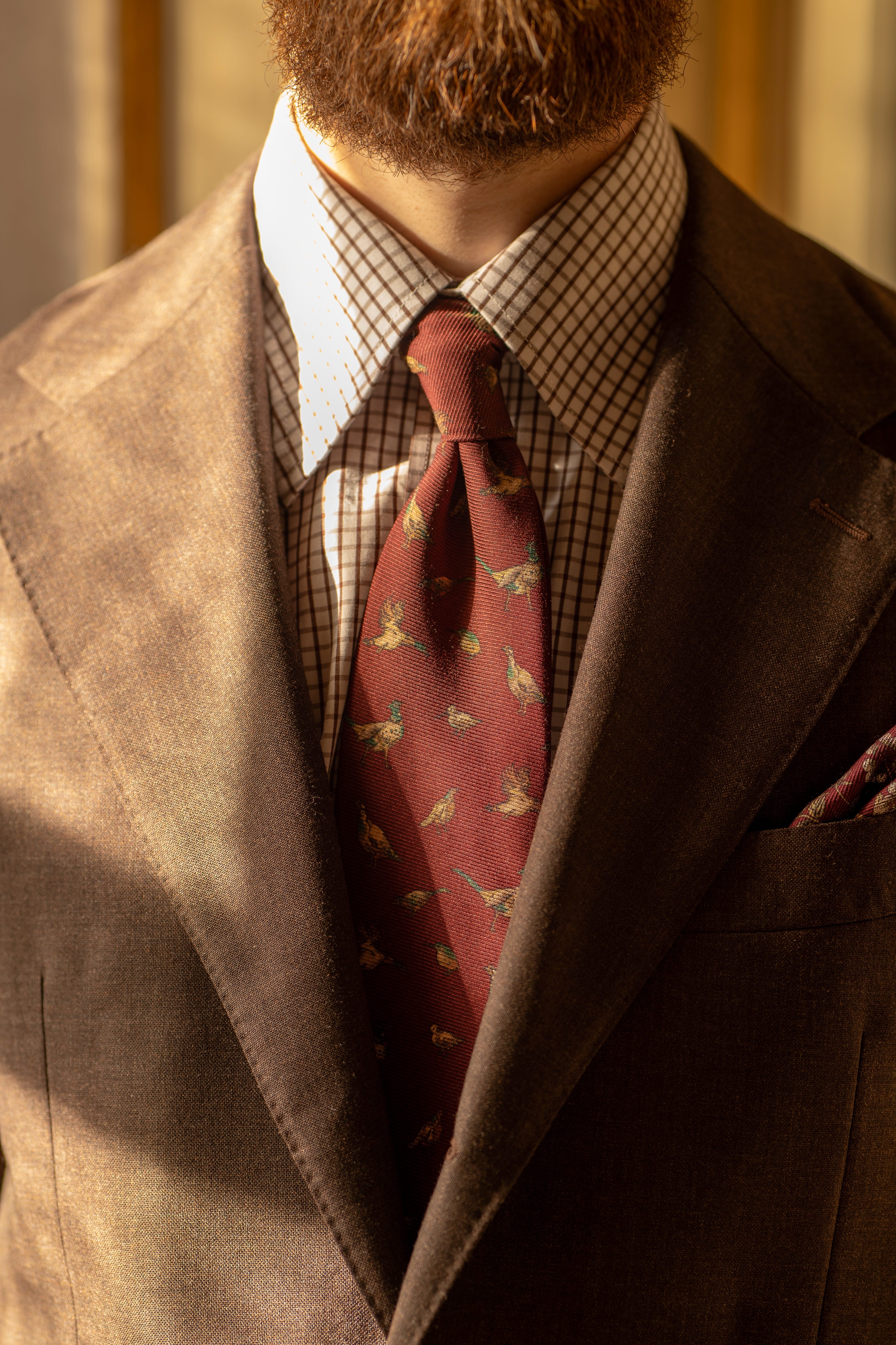
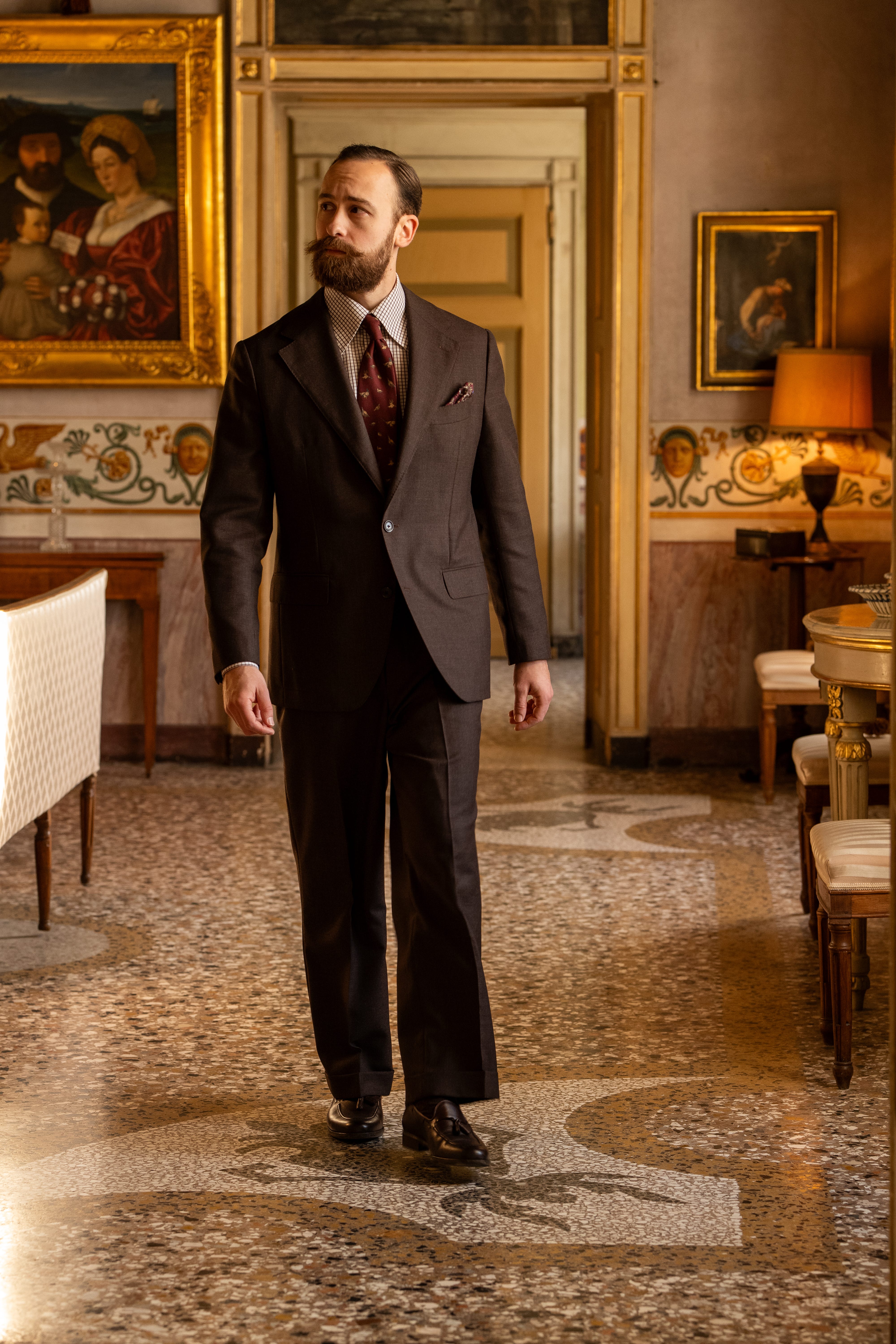
For now, let’s look at what makes this outfit go together so neatly, starting with my shirt. The checkered brown breaks up an otherwise stark white, thus toning down the contrast between the shirt and suit jacket. Just enough white is preserved to create visibly distinct parts, yet they still feel in harmony. For someone with mid-contrast features like myself, this is an ideal combination.
In the photo above, notice how Vincent’s white collar against his gray jacket creates a higher degree of contrast, and how this works well for him. For me, however, the checkered white and brown shirt is a safer bet. From that anchor, my tie and pocket square (or pochette, for our continental readers) then follow suit, adding to the layers of visual distinction without creating stark contrast.
But in the case of these two accessories, the real magic is found in their colors…
Color Is Key
Just as the color of a painting’s frame should complement the colors of the artwork itself, so should a tie, if possible, recall the natural colors in one’s face.
At first, this can be difficult to determine, as most people aren’t used to describing their face as “colorful”. But look closely, and with time it becomes apparent. Perhaps you have flickers of pink, or a more golden undertone. Perhaps your skin runs cooler, or falls on the ruddier side of the spectrum like mine does.
For me, this tie picks up on all the right colors: the muted burgundy reflects my face’s warm undertones, and the feathers of the waterfowl recall the natural color of my skin. The color green, to the extent that it is present, runs warmer rather than cooler, thus keeping in harmony with the overarching whole.
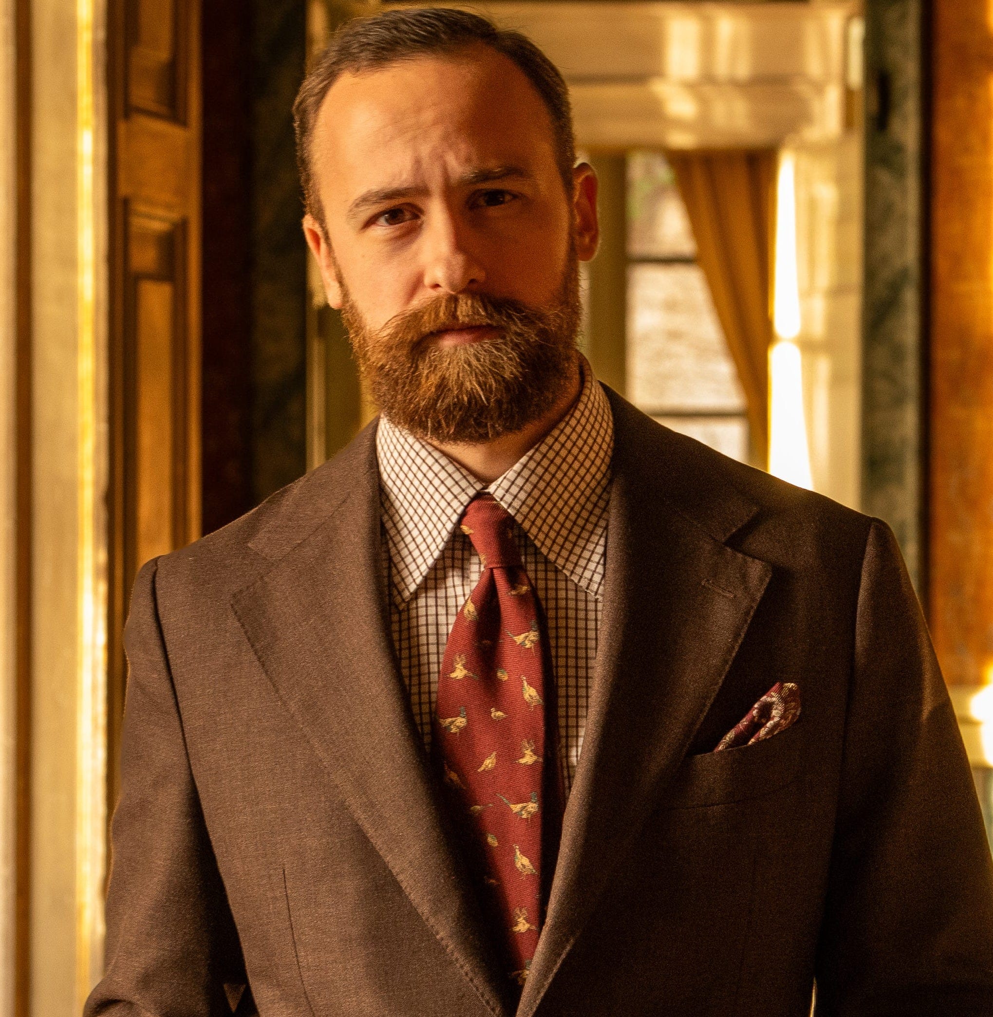
The pocket square introduces flecks of cooler colors (blue and green) into the mix, but this is acceptable, for a pocket square should complement as opposed to match your tie. It is also safely rooted, as with the entirety of the outfit, in the beautifully warm hue of the brown suit: a color which naturally harmonizes, of course, with my brown hair and beard.
To see this same concept of color illustrated on my friend Vincent, compare the earlier photo of him (in which he dons a yellow tie) with this one below. Of course, it’s not that he looks bad in the first photo. But in this second one, the white and navy stripes of the regimental tie pick up on his eye color, just as the muted red picks up on his pink complexion. The tie is much more “in harmony” with his natural features.
If you find yourself completely clueless as to which colors naturally show up in your face, then simply hold up different articles of clothing beneath it to see how they look. What you discover might surprise you: the colors that you’re naturally drawn to aren’t always the ones that look best on you, nor the ones that are most readily available. Most men, for example, look better in cream/ivory/eggshell colored shirts than they do in stark white ones, yet white shirts dominate the market.
Lastly, while there is undoubtedly a science to color theory, tastefully employing it in your dress is an art. Don’t be pedantic about color when starting out, simply practice your craft and learn by doing. In many ways, it’s just as much self-discovery as it is the development of a skill: you’ll learn which colors, shades, and hues look best on you, and in doing so you’ll become far more intentional about what you purchase.
If your experience is anything like mine, you’ll quickly find yourself saying “no” to far more items of clothing (and thus expenses) than you did before, precisely because you will have developed a clear understanding of what you do and don’t want in your wardrobe.
The Big Picture & the Fine Details
As the saying goes, “the whole is greater than the sum of its parts.” Today, we’ve focused on the primary role of color and contrast, but they are far from the only elements at play here.
Future installments of What’s In a Fit will explore how the size and shape of your shirt collar affect how you are perceived (something that becomes obvious when you compare the collars in these photos to what you typically find in stores) and why, in the words of Oscar Wilde, “clothes should hang from the shoulders, not the waist.” You’ll learn how to buy shoes that last you a decade, and which articles of clothing will make the biggest immediate impact as you embark on your quest to dress with elegance.
To support our work, and to get What’s In a Fit delivered to you each Friday, click below to join as a paid subscriber:
Even though I am not a man, I enjoyed the article. I agree it is all very personal, I have also looked into color seasons which was interesting but not a perfect fit either. Harmony is calming to look at but I would say that the style also reflects the character and then maybe being less harmonious would suit someone better... I also do not agree on summer making you more contrasted. Most people would get less contrasted with slightly lighter hair and darker skin... Just some thoughts :)
Is there a Substack like this for women?